 Click chart to enlarge
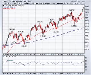
 That´s a fine chart. It presents the S&P 500 (blue line), the most important world index, and the same S&P500 priced in Gold (gray line), which shows the cost of the S&P 500 in ounces of Gold and is called the S&P 500/Gold ratio. It has been overlaid onto the chart for ease of comparison.
Will the S&P 500 go on climbing and manage to stay above all time highs? Though is obviously hard to answer, if that should be true we might well see gold catching up strongly. Today it takes 2.3 ounces of gold to “buy the S&P 500”, which is less than half of what we had to “pay” well back in 2000.
A curious conclusion is that the S&P may be headed to a sort of parabolic move somewhere in the future and that Gold seems solid anyway we look to the picture.












![[Most Recent Exchange Rate from www.kitco.com]](http://www.weblinks247.com/exrate/24hr-jpy-small.gif)
![[Most Recent Exchange Rate from www.kitco.com]](http://www.weblinks247.com/exrate/24hr-chf-small.gif)
![[Most Recent Exchange Rate from www.kitco.com]](http://www.weblinks247.com/exrate/24hr-cad-small.gif)
![[Most Recent USD from www.kitco.com]](http://www.weblinks247.com/indexes/idx24_usd_en_2.gif)
![[Most Recent Quotes from www.kitco.com]](http://www.kitconet.com/images/live/s_gold.gif)
![[Most Recent Quotes from www.kitco.com]](http://www.kitconet.com/images/live/s_silv.gif)
![[Most Recent Quotes from www.kitco.com]](http://www.kitconet.com/images/sp_en_6.gif)
![[Most Recent HUI from www.kitco.com]](http://www.weblinks247.com/indexes/idx24_hui_en_2.gif)
![[Most Recent Quotes from www.kitco.com]](http://www.kitconet.com/charts/metals/base/copper-d.gif)
![[Most Recent Quotes from www.kitco.com]](http://www.kitconet.com/charts/metals/base/zinc-d.gif)
![[Most Recent Quotes from www.kitco.com]](http://www.kitconet.com/charts/metals/base/aluminum-d.gif)
![[Most Recent Quotes from www.kitco.com]](http://www.kitconet.com/charts/metals/base/nickel-d.gif)