 Clicar no gráfico para aumentar
Chart courtesy of http://www.chartoftheday.com
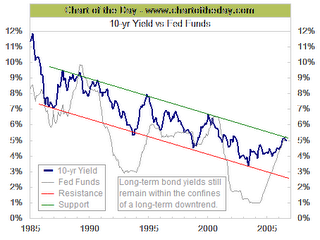
This chart compares the movement of the fed funds rate (gray line) to that of the 10-year Treasury bond yield (thick blue line). There are several points of interest. For one the fed funds rate is significantly higher than that of the 10-year Treasury bond (inverted yield curve). The last two times that happened (1989 and 2000), a recession soon followed. Also note how the yield of the 10-year Treasury bond has tended to peak before a major peak in the fed funds rate and also note how the 10-year is still within the confines of a long-term downtrend.

![[Most Recent Exchange Rate from www.kitco.com]](http://www.weblinks247.com/exrate/24hr-jpy-small.gif)
![[Most Recent Exchange Rate from www.kitco.com]](http://www.weblinks247.com/exrate/24hr-chf-small.gif)
![[Most Recent Exchange Rate from www.kitco.com]](http://www.weblinks247.com/exrate/24hr-cad-small.gif)
![[Most Recent USD from www.kitco.com]](http://www.weblinks247.com/indexes/idx24_usd_en_2.gif)
![[Most Recent Quotes from www.kitco.com]](http://www.kitconet.com/images/live/s_gold.gif)
![[Most Recent Quotes from www.kitco.com]](http://www.kitconet.com/images/live/s_silv.gif)
![[Most Recent Quotes from www.kitco.com]](http://www.kitconet.com/images/sp_en_6.gif)
![[Most Recent HUI from www.kitco.com]](http://www.weblinks247.com/indexes/idx24_hui_en_2.gif)
![[Most Recent Quotes from www.kitco.com]](http://www.kitconet.com/charts/metals/base/copper-d.gif)
![[Most Recent Quotes from www.kitco.com]](http://www.kitconet.com/charts/metals/base/zinc-d.gif)
![[Most Recent Quotes from www.kitco.com]](http://www.kitconet.com/charts/metals/base/aluminum-d.gif)
![[Most Recent Quotes from www.kitco.com]](http://www.kitconet.com/charts/metals/base/nickel-d.gif)
Sem comentários:
Enviar um comentário